Between doing market research, drafting mock-ups, and repeatedly asking clients to send you information, web designers can have much to do when designing a website. Which means sometimes even the most basic SEO elements get lost in the shuffle.
Remember, a site that can't be found in a search is useless, regardless of how nice it looks. It's always good to go back and double-check your keyword implementation towards the end of a site design.
1) Don't always take your client's advice on the best keywords for their industry or market. Take their suggestions, but do your own keyword research, because consumers often use different words than people within the business realize or expect.
2) Don't assume your client's competitor's sites are designed well. Their keywords/phrases may or may not be well chosen, so don't just start copying them in an effort to compete. Be careful looking at competitor info.
3) Don't simply choose keywords/phrases for your client's site that are hot in their industry, choose accurate ones that describe what they really do. The whole point of keyword selection (for legitimate business websites) is to get the correct visitors to the site. Traffic that isn't looking for what your client really sells is useless traffic, and will be a waste of their time to deal with.
4) Page titles such as "Home Page" or "Welcome To Joe's Lumber" are useless to both visitors and search engines.
5) Page descriptions such as "Home Page" or "Welcome To Joe's Lumber", or even "Joe's Lumber is your #1 source of lumber" are a waste of an important search engine tagline.
6) Use only one or two H1 headlines containing keywords, not dozens of them. In theory you could put the entire contents of a page inside one big H1 tag, but then search engines would see the whole thing as equally (un)important. Focus search engines toward several specific, logical, important elements that contain targeted keywords.
Saturday, September 24, 2011
Monday, August 29, 2011
Six Persistent Web Design Myths
Over the last few days I've been browsing some other web design sites and chatting with people. Here's a sample of some of the untrue, yet surprisingly persistent, beliefs still shared by many web designers:
1) An older website will rank higher in searches than a newer one
2) A site with many pages will rank higher than a site with few
3) Search engines have difficulty reading inside tables
4) You can tell a search engine how often to visit a site
5) It is important to submit sites to search engines
6) Code that is "compliant" with "standards" makes some kind of difference
There are other myths still circulating in the web design industry as well, some based on things that used to be true a long time ago, and some with no foundation in reality. This short list seemed like the most common.
It's hard to know if colleges are teaching this stuff by mistake, or if some bad apples in the industry are (still) intentionally trying to mislead new designers. Or perhaps people who are teaching themselves are being misinformed by what they see on poor quality sites and forums.
In the back of my mind, I'm inching closer to creating some kind of training course... although having confused competitors is fantastic. What to do?
Tuesday, August 23, 2011
Twitter Unveils User Photo Galleries
Twitter is now rolling out a photo hosting feature, with a preview of a user's images on their profile page and a link to a gallery of all their pictures.
You can access anyone's photo gallery either by clicking the link, or by adding "/media/grid" after their profile page address.
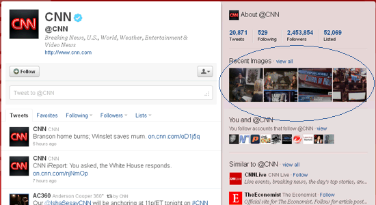
The profile shows 4 previews... https://twitter.com/#!/cnn

from the gallery page... https://twitter.com/#!/cnn/media/grid
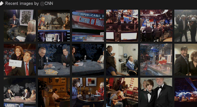
This is similar to what Facebook did long ago, showing a row of pictures at the top of user profiles. While Twitter says there's no way to control it, it seems the preview contains the 4 most recent pictures.
Now we'll see if people get as creative with the Twitter photo previews as they did with the Facebook photo previews.
One Great Security Advantage
Since Twitter allows you to upload a photo as part of any standard tweet, it eliminates the need to give third-party applications (twitpic, yfrog, img.ly, etc.) any access to your account. This is really fantastic because it eliminates any possibility of password theft or spamming your timeline.
You can access anyone's photo gallery either by clicking the link, or by adding "/media/grid" after their profile page address.
The profile shows 4 previews... https://twitter.com/#!/cnn
from the gallery page... https://twitter.com/#!/cnn/media/grid

This is similar to what Facebook did long ago, showing a row of pictures at the top of user profiles. While Twitter says there's no way to control it, it seems the preview contains the 4 most recent pictures.
Now we'll see if people get as creative with the Twitter photo previews as they did with the Facebook photo previews.
One Great Security Advantage
Since Twitter allows you to upload a photo as part of any standard tweet, it eliminates the need to give third-party applications (twitpic, yfrog, img.ly, etc.) any access to your account. This is really fantastic because it eliminates any possibility of password theft or spamming your timeline.
Wednesday, July 27, 2011
Six Basic Web Design Reminders
Here's a summary of some web design reminders that all webmasters should know, yet sometimes get overlooked in all the haste and details of building a website.
1) Design sites so they look and work properly on all browsers.
2) Design sites so they look and work properly at any resolution.
3) Be sure your sites still function and look right if a css call fails.
4) Be sure your sites still work when security-conscious users disable Java, Flash, scripting, etc. in their browsers.
5) Be sure your sites still look and work right if embedded objects fail (or are blocked per point #4 above). Don’t rely too heavily on plug-ins and widgets. Use trinkets sparingly for highlights, not the majority of basic content.
6) Keep your clients focused on their customers, not themselves. Gently remind them that the website isn't being built for their own amusement or to impress their buddies or competitors, but for their customers, future prospects, the public, or whatever the case really is.
Saturday, May 7, 2011
Top-Ranking Success: Graywood Sporting
The original website used detrimental text graphics in place of real text, the small amount of real text was Times Roman, every page was offset to the far left for no reason, everything was one shade of green upon green, and nothing was optimized for search engines to make any sense of.
Updates included centering pages, adding a custom background image, editing and formatting all the text, adding a plain text footer to every page, switching to plain text navigation links, SEO of every element from page titles to images, and updating the manufacturer, distributor, and sales contacts.
The redesign makes it cleaner, more colorful, and easier to read for visitors. And of course the real benefit to the client is a top-ranking website.
Saturday, April 23, 2011
Top-Ranking Success: Heritage Cattle Company
This is one of our very rare web design make-overs; we don't normally do "SEO work" on existing sites, since it tends to be more of a hassle than just building a site correctly from scratch. You have to go through someone else's code and remove stuff, add stuff, and edit almost everything, which ends up being twice as much work. In this case I knew the owners and did them a big favor.
The result? We turned a site that literally couldn't be found into a top-ranking winner.
The existing site had been up for a few years, yet we spent a hilarious half an hour trying to FORCE it to appear in search results and failed! We tried the name of the company, the town, the owner's names, and all those things combined and in long-string quotes, and still the site wouldn't come up on Bing, Yahoo, or Google.
It seemed the site either wasn't indexed or had possibly been banned (although that would be unlikely across all three of the big search engines). But we did find it indexed in all of them. It was just such poor web design that search engines didn't see anything of value and didn't know how to categorize it.
The first change was a new header on every page, with the company name, address, and phone number in plain text. Next was editing the copy to immediately tell visitors and search engines "We are a cattle farm that sells natural beef", which could have been implied from the original site but wasn't obvious. Then a pile of photos were added, since there were few. After that, tweaking all page elements for clarity.
The intention was to get it ranking well for "natural beef" in the Peterborough and Keene regions of Ontario. But now it actually ranks in the top 5 for "natural beef Ontario", which is substantial. It's certainly a long way from spending half an hour unable to find a site you know exists.
Wednesday, March 16, 2011
Top-Ranking Success: Discovery Child Care
 This is a fun and bright website using the client's selection of green and yellow to match their print material. There are many photos throughout the site, featuring parents and children at the day care.
The target audience is parents seeking child care in Peterborough, Ontario, so there are useful links and documents for them on the website. The parent handbook is one of several forms available to view or download, and links to regulatory and industry groups are prominent on the home page.
Top-10 ranking for this site was achieved by designing the site in the simplest possible way. Four pages with clean and obvious navigation; no ads, scripts, or embedded content; no css or other off-page or off-site calls. Nothing that doesn't directly describe the child care center. All content runs straight out of the root directory. Search engines and visitors have instant access to all content on the website within two clicks from anywhere.
Friday, March 4, 2011
Top-Ranking Success: Robin Walton
 Another rewarding top-10 website we designed is RobinWalton.ca, for a freelance illustrator in Ontario Canada. Robin is a true freehand artist, using chalk and pencil. The world is overflowing with computer graphic designers, so it was a treat being able to build a top-ranking website for a traditional artist.
The site is simple, basically a bio of the artist and some of her sample illustrations and drawings.
In terms of the top-10 website ranking, there weren't a lot of elements to add to the site that would have been of value to visitors, so we merely optimized what we had. In her effort to gain new book publishing clients, it was important that we kept the site simple and focused: freehand illustrations by a freelance artist. Paying attention to the basics was all it took. (This site has a broader audience than our typical local sites, being the entire province of Ontario, yet the ranking work remained much the same.)
Subscribe to:
Posts (Atom)