In the near future your website may have to be Android first, Chrome first, Google first. Maybe even Google Phone first. Apple, Microsoft, and others are doing little to change this. Unfortunately the problem is caused by consumers, who buy a phone, turn it on, and Google becomes their god. And they leave it that way. We've created the thing that controls us and irritates us.
Their demands and expectations of massive news websites, sports sites, shopping sites, and others are increasingly affecting small businesses. Many of the things they expect of those sites don't make sense for small business sites. A website for Fox News and a website for Sally's Bakery are about as different as night and day, but Google sees no difference. They've either stopped caring or the web is becoming too hard for their gen-whatever employees to figure out. Either way, your website needs to stand up to some absurd expectations you probably aren't aware of.
Google figures your website should use HTTPS/TLS (a brilliant technology but pointless for most small businesses), AMP and content delivery networks (a great idea for powerhouse ecommerce sites like Amazon and Ebay, but nearly useless for small local businesses), and possibly PWA (making websites behave like apps, blending components of both).
They require certain coding practices and page flow (specific placement of elements, above-the-fold content, ads, etc.), special treatment of links to your website from other places on the internet, it must pass their mobile friendly test, PageSpeed test, and abide by their quality guidelines. And of course you should be using Search Console and Google Analytics.
They expect your site to use the latest coding techniques, even if it means your site won't work for a large number of people because their phones or browsers don't have the latest updates. Getting the latest updates isn't always a smart thing to do, there are often valid concerns around security and bugs. And some users simply can't get the latest updates for a variety of reasons. Too bad for them.
The future is yet to come, so we'll see how far things continue on this path before a change happens. I think a fundamentally new way of looking at the web is on the horizon, at least from a search point of view.
This post is an epilogue to my article about The Evolution of Websites on SGDM.
Showing posts with label web design. Show all posts
Showing posts with label web design. Show all posts
Thursday, June 30, 2016


Thursday, May 19, 2016
EXIF Data and Unique Content
Only two groups of people ever used of Google+ in the early days: insider fan boys and professional photographers. Sort of a strange combination.
The fan boys were there because they'd already been invited into beta testing long before public release, and photographers began joining because they discovered uploaded photos retained all their exif data and thought that was a big deal.
Most websites at the time would reduce the size of uploaded images through some manner of shrinking, compressing, and stripping out exif data. This made things much faster and made sense because computer screens couldn't display anywhere near the resolution of real photographs and exif data was of no use to anyone.
 But for professionals wishing to share and appreciate photos taken by themselves and others, exif data is part of a photograph. It helps explain what's being seen in ways the rest of us don't get. Google just wanted to keep more details about everyone's pictures, but photographers found tremendous value in this feature.
The most important thing exif data does is identify an image as truly unique. Original content, so to speak. Likewise, it helps identify stock images used on thousands of websites, content that clearly isn't unique to any of those sites.
Because of this I believe Google will continue using exif data as a way to identify unique content for some time. This is one reason Second Glance Digital Media is happy to provide photography services for clients (locally of course), and encourages the use of original photos throughout your website and blog.
The fan boys were there because they'd already been invited into beta testing long before public release, and photographers began joining because they discovered uploaded photos retained all their exif data and thought that was a big deal.
Most websites at the time would reduce the size of uploaded images through some manner of shrinking, compressing, and stripping out exif data. This made things much faster and made sense because computer screens couldn't display anywhere near the resolution of real photographs and exif data was of no use to anyone.
The most important thing exif data does is identify an image as truly unique. Original content, so to speak. Likewise, it helps identify stock images used on thousands of websites, content that clearly isn't unique to any of those sites.
Because of this I believe Google will continue using exif data as a way to identify unique content for some time. This is one reason Second Glance Digital Media is happy to provide photography services for clients (locally of course), and encourages the use of original photos throughout your website and blog.
Tuesday, May 17, 2016
The Real Second Glance Digital Media
There is only one Second Glance Digital Media. However, several scammers and liars are using similar names to rip off unsuspecting victims like you.
 These people have stolen my identity instead of using an original business name. They do NOT have my decades of experience and success, be warned! (Some are terribly out of date, using unsafe and unsupported Flash (one of a cyber criminal's easiest ways into your computer), and building websites that aren't even mobile-friendly.)
These names were chosen to trick you into giving money to identity thieves. People using these names do NOT represent Second Glance Digital Media in any way:
- Second Glance Media
- Second Glance Design
- Second Glance Web Design
- Second Glance Website Design
- Second Glance Websites
Clients and prospects refer to my business in a variety of ways, sometimes using a combination of terms like those above. That's fine, but remember there is only one true Second Glance Digital Media, so be sure you're actually talking to me!

These names were chosen to trick you into giving money to identity thieves. People using these names do NOT represent Second Glance Digital Media in any way:
- Second Glance Media
- Second Glance Design
- Second Glance Web Design
- Second Glance Website Design
- Second Glance Websites
Clients and prospects refer to my business in a variety of ways, sometimes using a combination of terms like those above. That's fine, but remember there is only one true Second Glance Digital Media, so be sure you're actually talking to me!
Friday, May 13, 2016
Some Common Webmaster Mistakes
Note that this video is from 2013, although I doubt much would change if it were answered now in 2016. Same philosophy, different implementation.
Tuesday, May 10, 2016
The One-Page Business Website
One page websites are strange creatures. There may not be any navigation. There may not be any off-site calls. There is likely nothing to pre-fetch or pre-render. It limits your options in terms of linking, but it also focuses value on a single page. It gives Google only one chance to accurately interpret what you do.
 Just to clarify, on one hand we have the "infinitely scrolling pieces of crap", a page with lots of sections and different topics thrown together as a substitute for a logically structured website, and on the other hand we have small pages about one topic which are very simple.
For some businesses, one page works. Before they moved to another city, I had a client that ranked number one with a single-page website for years, in an industry that had some large, elaborate, expensive websites.
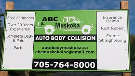
Once again one page wins the day. ABC Muskoka, an auto body repair shop, is a small business easily represented on one page. People know what auto body repair is. They know what rust repair is. They probably typed those exact words into Google. All they want is two things: an address and phone number. Everything else is bonus content to help them appreciate the high-quality work done at the shop, which is easily shown on one page. In a case like this, extra pages would be pointless, there would be nothing to gain.
For some businesses, one page works. Before they moved to another city, I had a client that ranked number one with a single-page website for years, in an industry that had some large, elaborate, expensive websites.
Once again one page wins the day. ABC Muskoka, an auto body repair shop, is a small business easily represented on one page. People know what auto body repair is. They know what rust repair is. They probably typed those exact words into Google. All they want is two things: an address and phone number. Everything else is bonus content to help them appreciate the high-quality work done at the shop, which is easily shown on one page. In a case like this, extra pages would be pointless, there would be nothing to gain.
Thursday, August 29, 2013
Website Update: Accounted For
Accounted For is an accounting business operating in Bracebridge, Ontario and serving the Gravenhurst and Huntsville vicinity. The owner of the business, Laura, visits many of her clients in person, and deals with others by computer and telephone.
 Accounted For provides personalized tax filing, payroll services, and bookkeeping. Whether you have a unique personal income tax situation (truck driver? stock trader? rental properties?), want to get your business finances tightened up, or just have some simple routine filings, she'll get the job done, and at an amazing price. She can also explain CRA correspondence and help you with audits if necessary.
This has been a top-10 ranking website since it was built many years ago, when the owner was originally in Peterborough. This change is a partly cosmetic, but primarily to re-target the website to residents of the Bracebridge area.
The site has just one page of content, designed to help a visitor determine if Accounted For provides the accounting services they need. It is modest compared to other accounting sites with many pages and flashy designs, but her clients aren't looking for a huge international accounting firm, and the simple look reflects the small business owners who form most of her clientele. I'm happy to continue providing this terrific small business with top-10 rankings in a field of much larger competitors.
Accounted For provides personalized tax filing, payroll services, and bookkeeping. Whether you have a unique personal income tax situation (truck driver? stock trader? rental properties?), want to get your business finances tightened up, or just have some simple routine filings, she'll get the job done, and at an amazing price. She can also explain CRA correspondence and help you with audits if necessary.
This has been a top-10 ranking website since it was built many years ago, when the owner was originally in Peterborough. This change is a partly cosmetic, but primarily to re-target the website to residents of the Bracebridge area.
The site has just one page of content, designed to help a visitor determine if Accounted For provides the accounting services they need. It is modest compared to other accounting sites with many pages and flashy designs, but her clients aren't looking for a huge international accounting firm, and the simple look reflects the small business owners who form most of her clientele. I'm happy to continue providing this terrific small business with top-10 rankings in a field of much larger competitors.
Tuesday, August 27, 2013
10 Reasons To Never Use Auto-Playing Sound or Video
Here's why auto-playing audio and video on a business website is a pointless, irritating interruption that should never be done (in no particular order):
1) people surf the web while listening to TV, music, audio books, etc.; sudden overlapping noise is baffling and infuriating
2) people surf the web while on Skype and other chat programs, and now you've pissed off everyone involved
3) for people listening to music wearing headphones, unexpected sounds are even more shocking
 4) only people with their speakers/headphones turned on will hear it anyway, so why bother?
5) some devices don't even have speakers; why auto-run something if users can't experience it?
6) the volume can be too loud, but also too quiet; users may not realize anything is playing
7) audio and video eats up expensive bandwidth for users, especially on cellular and mobile networks
8) people will leave rather than waste time figuring out how to turn it off
9) it's a horrible reminder of long ago when audio/video was a new gimmick web designers could offer clients
10) click-to-play is the solution, and gives you analytics that reflect intentional listens/views instead of meaningless "plays"
1) people surf the web while listening to TV, music, audio books, etc.; sudden overlapping noise is baffling and infuriating
2) people surf the web while on Skype and other chat programs, and now you've pissed off everyone involved
3) for people listening to music wearing headphones, unexpected sounds are even more shocking
4) only people with their speakers/headphones turned on will hear it anyway, so why bother?
5) some devices don't even have speakers; why auto-run something if users can't experience it?
6) the volume can be too loud, but also too quiet; users may not realize anything is playing
7) audio and video eats up expensive bandwidth for users, especially on cellular and mobile networks
8) people will leave rather than waste time figuring out how to turn it off
9) it's a horrible reminder of long ago when audio/video was a new gimmick web designers could offer clients
10) click-to-play is the solution, and gives you analytics that reflect intentional listens/views instead of meaningless "plays"
Tuesday, March 5, 2013
Website Redesign: Buckhorn Sand and Gravel
We've finished a new website for Buckhorn Sand & Gravel. They sell sand, gravel, and stone, and also offer construction and landscaping services. They've been in operation since 1963.
 Their website was never a major channel of marketing or communication, the telephone being the main point of contact. This explains why the site became neglected, and why they were still so busy despite it: their abandoned website honestly wasn't a detriment to business. But at least they realized the website didn't represent them, and made a wise call getting a new one built.
The goal here was to create something new, modern, and with better information, yet remain simple enough for their customers. Visitors get a thorough idea of their product line and range of services, and plenty of carefully selected photos (that pop-up to large versions). Customers will still phone or email regarding their projects, but the website is now much more useful to start with.
Colors stem from their logo's white and orange, with a textured rock background throughout. The site already appears in the top-10 search results for aggregate products and landscaping services in several of their target geographical areas.
Their website was never a major channel of marketing or communication, the telephone being the main point of contact. This explains why the site became neglected, and why they were still so busy despite it: their abandoned website honestly wasn't a detriment to business. But at least they realized the website didn't represent them, and made a wise call getting a new one built.
The goal here was to create something new, modern, and with better information, yet remain simple enough for their customers. Visitors get a thorough idea of their product line and range of services, and plenty of carefully selected photos (that pop-up to large versions). Customers will still phone or email regarding their projects, but the website is now much more useful to start with.
Colors stem from their logo's white and orange, with a textured rock background throughout. The site already appears in the top-10 search results for aggregate products and landscaping services in several of their target geographical areas.
Friday, February 8, 2013
Website Update: Maxama Protection
One of our existing web design clients, Maxama Protection, wants to grow their business in the Oshawa and Durham region. The company is based in Peterborough and provides security guards and marked cars throughout central Ontario. Their existing website is a top-ranking success that draws many inquiries.
 After some discussion we decided the best approach would be simply adding a page to their site about Oshawa security guard and patrol services. We could have created a second small website or tried adjusting the wording and content throughout the existing site to rank for Oshawa searches, but both those ideas are spammy and unprofessional. So we created one clean and focused page.
After about one month live, this page now ranks in the top 10 search results for Oshawa security guards! This is no doubt due to the high quality of the site we started with, plus the simple straight forward targeting of the new page.
After some discussion we decided the best approach would be simply adding a page to their site about Oshawa security guard and patrol services. We could have created a second small website or tried adjusting the wording and content throughout the existing site to rank for Oshawa searches, but both those ideas are spammy and unprofessional. So we created one clean and focused page.
After about one month live, this page now ranks in the top 10 search results for Oshawa security guards! This is no doubt due to the high quality of the site we started with, plus the simple straight forward targeting of the new page.
Tuesday, January 22, 2013
Website Redesign: Pharaoh Scents
This client sells aromatherapy sprays made with essential oils. The feel of the new site was to be very slick and atmospheric, fully themed with the product line.
 While not the worst website out there, it sure needed help. The sprawling white pages were too bright with little imagery to compliment the text. It was a design that worked with monitors available at the time of creation (i.e. 1024x768 or smaller), but with today's laptops and large desktop monitors, the dynamic layout was very strange looking.
The central work included nice clear recreations of the logo and other artwork, new product photos, and top-to-bottom code rewriting. It lacked even the simplest elements like H1 and ALT tags! This website had a full range of typical deficiencies, never mind SEO.
Online shopping will be added to the site in coming weeks, but the redesign is basically complete. Work will now continue towards improving the search rankings and driving traffic, with ongoing adjustments to the content and copywriting, as well as reaching out through social media. There are also several legitimate directories this company should be in that are specific to the products they sell.
While not the worst website out there, it sure needed help. The sprawling white pages were too bright with little imagery to compliment the text. It was a design that worked with monitors available at the time of creation (i.e. 1024x768 or smaller), but with today's laptops and large desktop monitors, the dynamic layout was very strange looking.
The central work included nice clear recreations of the logo and other artwork, new product photos, and top-to-bottom code rewriting. It lacked even the simplest elements like H1 and ALT tags! This website had a full range of typical deficiencies, never mind SEO.
Online shopping will be added to the site in coming weeks, but the redesign is basically complete. Work will now continue towards improving the search rankings and driving traffic, with ongoing adjustments to the content and copywriting, as well as reaching out through social media. There are also several legitimate directories this company should be in that are specific to the products they sell.
Friday, January 11, 2013
Top-Ranking Success: Naylor Systems
Naylor Systems manufactures very high quality marine equipment like aluminum docks, boat lifts, roller ramps for boats, and much more.
 They're a market leader in Ontario, with over 50 dealers selling their products. By virtue of their genuine popularity and credibility the website was actually ranking ok, the main issue was the look. Extra planning was needed to ensure smooth redirects from old pages, clear on-topic content, and continuing ranking success.
This was another tale of a site built by a prior employee and now outdated and not representative of their business. The photos were blurry, the layout confusing and inconsistent, product information was both old and not prioritized well, and the look was late-1990s at best. Not to mention the automated Flash slideshows with background music! I hadn't seen such a thing in years. I thought the internet was free of such insanity!
Many of the photos sent by the client were taken during a thunderstorm, with dark skies. And since this redesign was occurring in October and November (when people pack up their docks and equipment), there was no chance to get better pictures. Much time was spent to salvage these otherwise good photos.
The website really turned into an online sales brochure, focusing on the details of their products. A lot of information is provided, yet the site remains simple and easy to use. Some of this was accomplished by putting non-core information in pop-ups (using pure CSS, so they work even on Internet Explorer 8 on Windows XP!). Great client, great business, and now a great new website with compliments coming in!
They're a market leader in Ontario, with over 50 dealers selling their products. By virtue of their genuine popularity and credibility the website was actually ranking ok, the main issue was the look. Extra planning was needed to ensure smooth redirects from old pages, clear on-topic content, and continuing ranking success.This was another tale of a site built by a prior employee and now outdated and not representative of their business. The photos were blurry, the layout confusing and inconsistent, product information was both old and not prioritized well, and the look was late-1990s at best. Not to mention the automated Flash slideshows with background music! I hadn't seen such a thing in years. I thought the internet was free of such insanity!
Many of the photos sent by the client were taken during a thunderstorm, with dark skies. And since this redesign was occurring in October and November (when people pack up their docks and equipment), there was no chance to get better pictures. Much time was spent to salvage these otherwise good photos.
The website really turned into an online sales brochure, focusing on the details of their products. A lot of information is provided, yet the site remains simple and easy to use. Some of this was accomplished by putting non-core information in pop-ups (using pure CSS, so they work even on Internet Explorer 8 on Windows XP!). Great client, great business, and now a great new website with compliments coming in!
Tuesday, October 16, 2012
Top-Ranking Success: Granite Ridge Estates
Our latest top-10 website client is Granite Ridge Estates in Buckhorn, Ontario. They build custom luxury homes in their own subdivision in Buckhorn, as well as throughout the Kawartha Lakes.
They had an old website that was outdated and didn't reflect their current business very well. It was more or less just awful Flash slideshows and very little text.
 The focus of the site now, aside from proper descriptions of what the company does, is tons of interior and exterior home photos (galleries that clearly show all the images available and can be navigated freely), plus actual floor plans of their various base models that can be printed out.
Work included an update to their logo, several on-location photo shoots, new high-resolution scans of dozens of floor plans, and lots more. The look of the site was made clean and classy by using simple black and white along with earth-toned colours like those found in the homes they build.
They had an old website that was outdated and didn't reflect their current business very well. It was more or less just awful Flash slideshows and very little text.
The focus of the site now, aside from proper descriptions of what the company does, is tons of interior and exterior home photos (galleries that clearly show all the images available and can be navigated freely), plus actual floor plans of their various base models that can be printed out.Work included an update to their logo, several on-location photo shoots, new high-resolution scans of dozens of floor plans, and lots more. The look of the site was made clean and classy by using simple black and white along with earth-toned colours like those found in the homes they build.
Thursday, June 21, 2012
Old School Web Design:
A "Contact" Page
Is there anything more inexplicable about a business website than being unable to find contact information?
You're interested, ready to buy, or simply want more information, but ...you can't find the email address, street address, or phone number!
Which is because it's been stuck on a page all by itself somewhere else on the site. Not a shred of contact information anywhere except that one page.
This is another classic design mistake that heralds back to the days when graphic designers were told to make websites, and sought to create as many pages as possible from a slim amount of information.
It seems like an extension of the website-as-brochure mindset from the early days. Maybe graphic designers were so used to putting contact information only on the back of a flyer they figured it would only have one place on a website as well.
But it's more helpful to think of web pages in terms of a letterhead, where there should be essential information at your fingertips at all times. A visitor should be able to call a business or send an email from whatever page they happen to be on, instead of having to wander off to a separate part of the site. That breaks how visitors naturally move around a website, and demands they take at least one extra step just to get in touch... and probably moves them away from what got them interested in the first place!
In fairness, a contact page isn’t pointless in every case, just misused on a grand scale. If you have 35 offices, then yes, a contact page is appropriate, but at least a head office or 1-800 number should still appear on every page.
Just like the "enter" or "splash" page, never make your visitors jump through a hoop to do something as basic as contacting you.
You're interested, ready to buy, or simply want more information, but ...you can't find the email address, street address, or phone number!
Which is because it's been stuck on a page all by itself somewhere else on the site. Not a shred of contact information anywhere except that one page.
This is another classic design mistake that heralds back to the days when graphic designers were told to make websites, and sought to create as many pages as possible from a slim amount of information.
It seems like an extension of the website-as-brochure mindset from the early days. Maybe graphic designers were so used to putting contact information only on the back of a flyer they figured it would only have one place on a website as well.
But it's more helpful to think of web pages in terms of a letterhead, where there should be essential information at your fingertips at all times. A visitor should be able to call a business or send an email from whatever page they happen to be on, instead of having to wander off to a separate part of the site. That breaks how visitors naturally move around a website, and demands they take at least one extra step just to get in touch... and probably moves them away from what got them interested in the first place!
In fairness, a contact page isn’t pointless in every case, just misused on a grand scale. If you have 35 offices, then yes, a contact page is appropriate, but at least a head office or 1-800 number should still appear on every page.
Just like the "enter" or "splash" page, never make your visitors jump through a hoop to do something as basic as contacting you.
Monday, June 11, 2012
Old School Web Design:
Works Only On Internet Explorer
This issue stems from the fact that about 15 years ago Internet Explorer was the dominant web browser by a huge margin. But 15 years is a heck of a long time, and anyone today still building websites using FrontPage or any other WIndows-specific design tool needs to give their head a shake!
 For some reason there are websites still being built today that only look and work correctly on Internet Explorer. Do these designers not understand that different browsers render code differently? Could they not bother spending a few minutes to test their sites? Why are they even building websites if they don't know what they're doing? How can they sleep at night knowing they are charging good money to build websites that won't even work right for many of the people who try to use them?
There are five major browsers in use today, and while Internet Explorer is still common on desktop computers, it is essentially non-existent on mobile devices. And we all know how mobile device use has skyrocketed in the last few years, soon to overtake laptops and desktops for overall internet use.
Building websites that only look and work right on IE is a sure way to neglect at least half of the visitors to an average website, close to all the visitors of any tech or geek-related site (typically using Chrome or Firefox), and basically everyone using a mobile device.
Now sure, some websites built for IE will work correctly on other browsers by default without any extra effort, as long as they are of simple and standard design. But the days of designing primarily for IE and hoping for the best are long gone. It simply isn't the dominant browser like it was 15 years ago.
We build websites that look and work exactly the same on any browser at any resolution. It takes a bit of extra work, but it's not that hard. Don’t let anyone tell you some nonsense about what they think your customers and prospects prefer, or tell you it's hard to make compatible or standardized websites, or tell you it will cost more. It's easy for anyone who ought to be calling themselves a "web designer".
For some reason there are websites still being built today that only look and work correctly on Internet Explorer. Do these designers not understand that different browsers render code differently? Could they not bother spending a few minutes to test their sites? Why are they even building websites if they don't know what they're doing? How can they sleep at night knowing they are charging good money to build websites that won't even work right for many of the people who try to use them?
There are five major browsers in use today, and while Internet Explorer is still common on desktop computers, it is essentially non-existent on mobile devices. And we all know how mobile device use has skyrocketed in the last few years, soon to overtake laptops and desktops for overall internet use.
Building websites that only look and work right on IE is a sure way to neglect at least half of the visitors to an average website, close to all the visitors of any tech or geek-related site (typically using Chrome or Firefox), and basically everyone using a mobile device.
Now sure, some websites built for IE will work correctly on other browsers by default without any extra effort, as long as they are of simple and standard design. But the days of designing primarily for IE and hoping for the best are long gone. It simply isn't the dominant browser like it was 15 years ago.
We build websites that look and work exactly the same on any browser at any resolution. It takes a bit of extra work, but it's not that hard. Don’t let anyone tell you some nonsense about what they think your customers and prospects prefer, or tell you it's hard to make compatible or standardized websites, or tell you it will cost more. It's easy for anyone who ought to be calling themselves a "web designer".
Friday, June 1, 2012
Old School Web Design: An “Enter” page
Also known as a splash page. Have you ever come across one of these? It’s basically a huge empty page with a logo and a link to enter the actual website.
 This is a leftover from times when no one really knew what to do with a website, but wanted more than just one page with their flyer on it, so they tossed up an extra page with nothing but the company logo on it.
It might say something like: "Welcome, you are now at the website of Joe’s Peanuts. Please click HERE to enter our site..."
There are only two types of sites that might need a landing page or splash page: A multi-national site asking you to select a language or country, or a porn site that requires a legal warning or disclaimer. For all other sites an entry page is pointless and indicates an amateurish delight in having as many pages as possible, which is nothing but detrimental and irritating to users.
Your home page needs to be a real home page, rich with content.
Entry pages also present a huge problem in terms of ranking in web searches. If one home page is completely devoid of content, how do you suppose it stacks up against other websites with normal home pages full of information? Do you think Google and Bing would consider it more useful or less useful to users?
Give your visitors what they came for. Never make someone jump through a hoop just for the privilege of getting to your home page!
(P.S. If you do need to remove a splash page from your site, make sure your webmaster is going to do a proper 301 redirect.)
This is a leftover from times when no one really knew what to do with a website, but wanted more than just one page with their flyer on it, so they tossed up an extra page with nothing but the company logo on it.
It might say something like: "Welcome, you are now at the website of Joe’s Peanuts. Please click HERE to enter our site..."
There are only two types of sites that might need a landing page or splash page: A multi-national site asking you to select a language or country, or a porn site that requires a legal warning or disclaimer. For all other sites an entry page is pointless and indicates an amateurish delight in having as many pages as possible, which is nothing but detrimental and irritating to users.
Your home page needs to be a real home page, rich with content.
Entry pages also present a huge problem in terms of ranking in web searches. If one home page is completely devoid of content, how do you suppose it stacks up against other websites with normal home pages full of information? Do you think Google and Bing would consider it more useful or less useful to users?
Give your visitors what they came for. Never make someone jump through a hoop just for the privilege of getting to your home page!
(P.S. If you do need to remove a splash page from your site, make sure your webmaster is going to do a proper 301 redirect.)
Wednesday, May 23, 2012
Old School Web Design:
A "Website" That's Just A Giant Animation
This is the more modern equivalent to using a single picture as a web page: using a single animation as a web page.
Some graphic designers with a knack for using animation software will take all the elements of a normal web page and put them into an animation file rather than a picture file.
 It’s easy to get caught up in something familiar and use it for everything that comes along, without regard for the user experience, the purpose of the site, the way search engines work, the need for regular updates, compatibility across devices, or the advantages and opportunities of new coding developments.
It's the old “When you have a hammer, everything looks like a nail” situation that existed in the early days of the web, when design options were very limited.
Illustrators figured websites would be elaborate illustrations. Animators envisioned websites as animations. Neither was wrong, it's just that those familiar individual preferences have become out of date because the internet has evolved so much.
Modern websites can include text, pictures, video, audio, animations, and more. They all have their place, and to build an entire website in only one medium is unnecessarily limiting to users. The choice should belong to the user, and, for example, not alienate blind or deaf visitors due to content they can't experience.
To be fair, in both cases (a "web page" that's either a picture or animation) it's often the design and animation software that is largely to blame, by having misleading options like "export as web page" or "export for web". These are handy software features, and perhaps suitable for personal web pages, but certainly not for business websites that need to be built to maximize search engine comprehension, accommodate all users on all devices, and correspond with how the internet works today.
Some graphic designers with a knack for using animation software will take all the elements of a normal web page and put them into an animation file rather than a picture file.
It’s easy to get caught up in something familiar and use it for everything that comes along, without regard for the user experience, the purpose of the site, the way search engines work, the need for regular updates, compatibility across devices, or the advantages and opportunities of new coding developments.It's the old “When you have a hammer, everything looks like a nail” situation that existed in the early days of the web, when design options were very limited.
Illustrators figured websites would be elaborate illustrations. Animators envisioned websites as animations. Neither was wrong, it's just that those familiar individual preferences have become out of date because the internet has evolved so much.
Modern websites can include text, pictures, video, audio, animations, and more. They all have their place, and to build an entire website in only one medium is unnecessarily limiting to users. The choice should belong to the user, and, for example, not alienate blind or deaf visitors due to content they can't experience.
To be fair, in both cases (a "web page" that's either a picture or animation) it's often the design and animation software that is largely to blame, by having misleading options like "export as web page" or "export for web". These are handy software features, and perhaps suitable for personal web pages, but certainly not for business websites that need to be built to maximize search engine comprehension, accommodate all users on all devices, and correspond with how the internet works today.
Friday, May 18, 2012
Old School Web Design:
A "Website" That's Just A Giant Picture
This is probably the most severe old-school flashback, nearly two decades out of date.
To this day, some so-called websites are no more than a huge graphic. All of the text and images, instead of being real elements, are actually parts of a single picture displayed on the screen (a .jpg or.gif, etc.).
 When the internet was new and business owners told their graphic designers to put up a web page, they'd open their desktop publishing software and export an existing brochure or other marketing piece as a picture file. Then that picture could be displayed with just a few lines of HTML. Bingo, instant website.
For example, many of the first restaurant websites were often just images of their print menu.
It was natural for this to happen. Since the field of “web design” didn’t exist, business owners called upon their graphic designers to make web pages. And since it required no more than a few clicks in the desktop publishing or illustration software they were already using, everything worked out at the time.
But be careful your web designer isn’t still using graphic design software to lay out your site’s content and then saving it as a picture file. That isn’t web design, it’s photo editing!
To this day, some so-called websites are no more than a huge graphic. All of the text and images, instead of being real elements, are actually parts of a single picture displayed on the screen (a .jpg or.gif, etc.).
When the internet was new and business owners told their graphic designers to put up a web page, they'd open their desktop publishing software and export an existing brochure or other marketing piece as a picture file. Then that picture could be displayed with just a few lines of HTML. Bingo, instant website.For example, many of the first restaurant websites were often just images of their print menu.
It was natural for this to happen. Since the field of “web design” didn’t exist, business owners called upon their graphic designers to make web pages. And since it required no more than a few clicks in the desktop publishing or illustration software they were already using, everything worked out at the time.
But be careful your web designer isn’t still using graphic design software to lay out your site’s content and then saving it as a picture file. That isn’t web design, it’s photo editing!
Tuesday, May 15, 2012
Old School Web Design:
Is Your Website Stuck In The 1990s?
Way back in the mid-1990s the internet leapt out of military and educational institutions and became accessible to the masses.
At that time, business owners saw websites as a new version of a flyer, billboard, and/or newspaper ad. But unlike printed material, they could be changed in an instant with new text, images, colors, etc. No need to reprint 10,000 flyers because of a spelling mistake or a change in pricing, hooray!
So websites became the new version of print advertising, reflecting all the design techniques of the print industry.
In those early days, companies put up sites hastily. Then, as the internet evolved, those sites were replaced with better content. Technology brought incredible changes, and web pages quickly became nothing at all like flyers, billboards, or newspaper ads. The internet moved way beyond being just a new form of print advertising.
But like the zombie of an old traveling salesman who doesn’t realize what’s happening around him, some of the dead and buried practices of decades ago still linger on the web.
The next few posts will highlight some of these tragic relics of last century you can still find on the internet today.
If your site is stuck in the 1990s, have your webmaster fix it, quick!
At that time, business owners saw websites as a new version of a flyer, billboard, and/or newspaper ad. But unlike printed material, they could be changed in an instant with new text, images, colors, etc. No need to reprint 10,000 flyers because of a spelling mistake or a change in pricing, hooray!
So websites became the new version of print advertising, reflecting all the design techniques of the print industry.
In those early days, companies put up sites hastily. Then, as the internet evolved, those sites were replaced with better content. Technology brought incredible changes, and web pages quickly became nothing at all like flyers, billboards, or newspaper ads. The internet moved way beyond being just a new form of print advertising.
But like the zombie of an old traveling salesman who doesn’t realize what’s happening around him, some of the dead and buried practices of decades ago still linger on the web.
The next few posts will highlight some of these tragic relics of last century you can still find on the internet today.
If your site is stuck in the 1990s, have your webmaster fix it, quick!
Wednesday, May 9, 2012
Faster Website = Higher Search Ranking
Web Page Loading Speeds
Can you think of a time when you went to a website and it seemed like it wasn't going to load, but you waited and it finally did?
Even 5 to 10 seconds for most people seems like forever compared to typical web pages that load instantly. We sure take lightning speed for granted, don't we?
I generally abandon a site if it takes more than about 5 seconds to load because I assume it's either poorly designed, and/or utilizing unecessary plugins, and/or redirecting to another site improperly, and/or it is infected with malware.
It isn't because 5 seconds is a long time, it's because I have no idea if it has crashed or if it will end up being 60 seconds, by which time I could have already found what I wanted on another site. And it's also because I know how dangerous it is to be on an infected website for even a few seconds.
(Here's a video explaining what is called drive-by malware.)
We Build Fast Websites
It makes sense then that one of the 200+ criteria that Google uses to evaluate website quality is the time it takes for pages to load. As mentioned above, whether it's because of sloppy design or something else, a slow loading page is a poor experience for internet users. So for two websites with the same overall credibility and value, Google will give the edge in search results to the faster one because it will be a better experience for the end user.
Google added site speed to their list of ranking criteria back in 2010. Here's the official site speed announcement.
Because of this, Second Glance Digital Media takes extra steps to increase the speed of every website we build for every client. By optimizing server settings, site architecture, and individual page design, it's just one of the many things we do to stay on top, in order to keep our clients and their businesses on top!
Can you think of a time when you went to a website and it seemed like it wasn't going to load, but you waited and it finally did?
Even 5 to 10 seconds for most people seems like forever compared to typical web pages that load instantly. We sure take lightning speed for granted, don't we?
I generally abandon a site if it takes more than about 5 seconds to load because I assume it's either poorly designed, and/or utilizing unecessary plugins, and/or redirecting to another site improperly, and/or it is infected with malware.
It isn't because 5 seconds is a long time, it's because I have no idea if it has crashed or if it will end up being 60 seconds, by which time I could have already found what I wanted on another site. And it's also because I know how dangerous it is to be on an infected website for even a few seconds.
(Here's a video explaining what is called drive-by malware.)
We Build Fast Websites
It makes sense then that one of the 200+ criteria that Google uses to evaluate website quality is the time it takes for pages to load. As mentioned above, whether it's because of sloppy design or something else, a slow loading page is a poor experience for internet users. So for two websites with the same overall credibility and value, Google will give the edge in search results to the faster one because it will be a better experience for the end user.
Google added site speed to their list of ranking criteria back in 2010. Here's the official site speed announcement.
Because of this, Second Glance Digital Media takes extra steps to increase the speed of every website we build for every client. By optimizing server settings, site architecture, and individual page design, it's just one of the many things we do to stay on top, in order to keep our clients and their businesses on top!
Monday, April 23, 2012
Does Your Website Work Right On All Browsers?
Today's post is a reminder that there are five major web browsers people use to surf the internet, plus a variety of mobile devices with potential quirks regarding how they show web pages. Does your website look and behave the same on all of them? When was the last time you checked?
In days of old, web designers would build only for Internet Explorer and many sites would fail sadly on other browsers. Things are much more standardized today, both in terms of technology and the way designers build sites, but there are still vast differences among computers, browsers, and devices that warrant a routine compatibility check.
Like everyone else, business owners and managers have their own preferred web browser and typically only ever see their site using that one. It's time for a quick look to be sure all your visitors are experiencing your website properly.
Here are the download links for each major browser:
Internet Explorer
Firefox
Chrome
Opera
Safari
To check the look and functionality of your site on mobile devices, you'll need to get hold of (or ask someone who has) an Android, Blackberry, iPhone, iPad, and whatever else.
These days desktop and laptop browsers are split primarily across IE, Chrome, and Firefox, so at least ensure full compatibility and functionality across those three. But the truth is your website should be designed to work the same on all browsers and devices.
If you find problems, we can likely help. We design responsive websites for all browsers and resolutions. Drop us an email.
In days of old, web designers would build only for Internet Explorer and many sites would fail sadly on other browsers. Things are much more standardized today, both in terms of technology and the way designers build sites, but there are still vast differences among computers, browsers, and devices that warrant a routine compatibility check.
Like everyone else, business owners and managers have their own preferred web browser and typically only ever see their site using that one. It's time for a quick look to be sure all your visitors are experiencing your website properly.
Here are the download links for each major browser:
Internet Explorer
Firefox
Chrome
Opera
Safari
To check the look and functionality of your site on mobile devices, you'll need to get hold of (or ask someone who has) an Android, Blackberry, iPhone, iPad, and whatever else.
These days desktop and laptop browsers are split primarily across IE, Chrome, and Firefox, so at least ensure full compatibility and functionality across those three. But the truth is your website should be designed to work the same on all browsers and devices.
If you find problems, we can likely help. We design responsive websites for all browsers and resolutions. Drop us an email.
Subscribe to:
Posts (Atom)